So I got some stuff done this weekend (including a new header above). Just as planned! I'll be posting on my progress throughout the week...
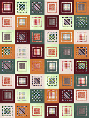
This is a screen shot from PhotoShop. I posted more about my quilt design process here and here and here.
I think I maybe have the final layout for my husband's quilt. I realized that the chosen fabrics didn't look so hot in any traditional quilt blocks. So I'm going a little Denyse Schmidt. Not all crooked, just boxy. Denyse Schmidt inspired, you might say. I'm diggin' it. And more importantly, the husband seems to like it (I showed him this screen and he said "Oh. Cool.").
What do you all think? I'm begging for feedback here! My concerns are that it's not going to come out as I envision it and that the quilt isn't balanced...or is it too balanced??? I guess I just have some jitters and would love to hear any suggestions or feedback.
My goal is to start cutting next weekend. Unless you all convince me to do something completely different!
PART 6 - First Block
PART 5 - Quilt Math
PART 4 - Give Opinions
PART 3 - Fabric
PART 2 - Inspiration
PART 1 - Palette
Monday, January 28, 2008
Quilt Design Process 4 - Please give opinions!
Labels:
Quilts/Patchwork
Subscribe to:
Post Comments (Atom)


6 comments:
I really like the quilt!! And as you said, more importantly your husband likes it. I have found that over the years of quilting, my husband has developed a certain style of quilts that he likes. I say go with it.
Also, I like your new header. I just purchased a few more Red Sox tickets today...they went on sale on Sat. I am so excited for opening day. I added an opening day ticker to my blog. Hop on over to see it and enter my giveaway while you are there. Good luck!!
I can't wait to see the progress on the quilt.
that will turn out great!
personally, i think it looks fabulous!! it's a great balance and i'm sure it will turn into a fantastic quilt!
Your header came out great! I think your quilts certainly looks balanced enough. I wouldn't try to balance it any more than you have because then it will look too thought out, too formal. Something fun I like to do when my quilts are fairly well balanced and tied together is to have one small thing somewhere in the quilt different--it sort of personalizes it even more. Maybe one swatch of fabric that is slightly different color than the rest of the quilt, one small corner cut off somewhere. But I do love this design, quite nice!
I agree with everyone - it looks great! Looking forward to seeing it sewn.
I think it looks great. The boxes and different values gives some movement to the geometric shapes. Very neat. Cut away!
Post a Comment