

 Reverse appliquéd "Starflower" B-12 block.
I'm two blocks behind on my Dear Jane quilt. And another block is being assigned today. I was feeling a little anxious about it but then I realized, "Hey, it's a quilt." And I relaxed. I'll get farther behind before I catch up because we are going on vacation next week. But I will eventually get ahead again. No worries.
Here's where I am so far: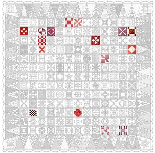
Over on the Dear Baby Jane blog and flickr group, there's been some discussions about adding the sashing (fabric between all the blocks) as we go. I would like to start adding it now but that means I need to decide on colors. That's where you all come in. Here's two options I'm thinking about. Take a look, ponder it a while and then leave a comment with your honest opinion.
Light version (darker than my block background but not too dark):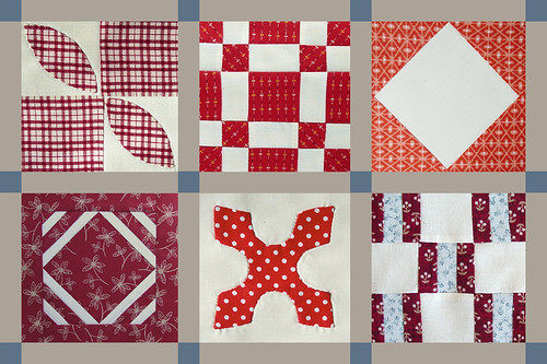
Dark version (helps the blocks stand out more but is it too much?):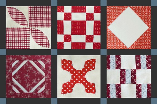
PS: My mother called this weekend and asked me if I bought a bathing suit. She had read on my blog that I needed to get one but I hadn't followed up. Rest assured, a swimsuit has been purchased. As well as a cover-up, some flip flops and loads of sunscreen with an SPF of +5,000. Anyone want to guess where we're going next week?
Friday, April 25, 2008
Dear Jane B-12
Subscribe to:
Post Comments (Atom)


15 comments:
I love your Jane blocks. But it's really hard to decide which sashing I like better. I'm leaning towards the lighter, I think, because I'm really intrigued with the idea of a whole Dear Jane quilt that is essentially red & white. I LOVE red & white.
My first instinct was the lighter. But then I looked at it again and the darker drew my eye over and over. Really seems to make the blocks pop more. So, I'm thinking the dark. The other seems to muddy it a bit.
Where are you going?...Florida, Hawaii...naw definitely Tahiti!!!
Dark. Go dark.
Hawaii? We're going to Maui in August so I have Hawaii on the brain. I need to get my beach body back (if that's possible at my age) before I can even think about swimsuits.
I can't decide... However I figured that I'd leave the reasons I can't decide: The dark is really neat! It draws you in, has you look at the contrast, see each block. But, there is a lot of contrast. The light lets the entire quilt stand together and each block is a part of the whole. So, yeah, I don't know either:) I know, so helpful!
I looked again, going back to the post, and I change my mind: I vote for the dark. The block still speak to each other, but the dark is a really pretty backdrop. Okay, I'll leave you alone now!
This is tough... but my first instinct is to go light. I don't have any good reason for that though. It just felt better when I looked at it. But, as everyone else has said, the blocks do really pop on that dark, and it would indeed be quite striking. Actually, the more I think about it, the more I like the dark. Yeah. Go dark.
Vacation! You lucky duck! And somewhere warm even... I'm sooo jealous.
I tried to subscribe to your blog throught the link at the end of the page (Post Atom) and I got an error page from FeedBurner. Maybe you should check it. I'll be back to try to subscribe again.
Claudia: Thanks for letting me know about the error. I get an error as well using the bottom link.
Try the link in the right hand column "Subscribe to Sew & Sox". That one is working fine for me.
Thanks again! And thank you also for subscribing!
Jen
I like the lighter sashing. It separates the blocks nicely, but doesn't look like bars. Each block doesn't need to "pop", it makes it too busy; your eyes don't know where to look. With the lighter sashing each block quietly speaks for itself, very subtle.
JMom
Yours are turning out so nice. I will post my one that looks like my dog made it later this week. I was so discouraged about it over the weekend. If I don't start paper piecing they will all look like crap. I know its just a quilt. But I really really have a block when it comes to paper piecing. I'm proud of you even if I have a little quilt envy.
These two sashing choices have totally different effects! I prefer the lighter one, because it evokes the history and nostalgia that makes the quilt so interesting. But if you want something striking, powerful, with a more modern feel the dark will look great too. Can't wait to see what you choose!
I think I prefer the darker one, with white corner stones
My vote's to go light. White, even. But then again, I'm just not a fan of dark quilts.
I also like the lighter version. I think the dark version distracts from the beauty of the blocks.
Go light. I think the darker one overpowers the blocks. But then who am I to say. I have yet to do start a Dear Jane, but I need to get my UFOs out of the way first!
Enjoyed your blog!
8-)
Post a Comment